Sneak Peek at the New Customer User Interface in OTRS CE 6.0.38
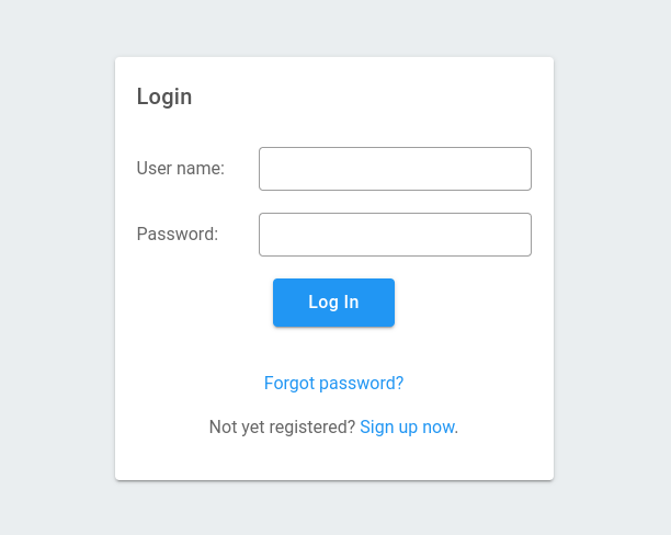
The upcoming version 6.0.38 of ((OTRS)) Community Edition, which is scheduled to be released before the end of the year, features the introduction of the refreshed customer user interface. This is part of our ongoing effort to make the UI of the system more user-friendly and appealing, for both agents and customer users.
We are pleased to show a few pictures of the new interface and the changes that it brings.

New Look of the Ticket Screen
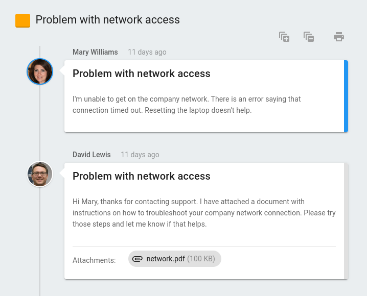
The most significant improvements have been made to the part of the interface where customer users probably spend the most time — the expanded ticket screen. In the new version, it is displayed in a way that's similar to the conversation layout often used in web-based email services.

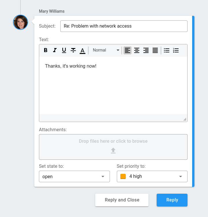
The message form now makes use of modernized input controls, such as a new text editor box and ticket priority selection list with colors.

Refreshed New Ticket Form
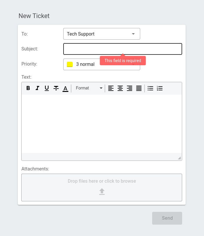
The "New Ticket" form has been redesigned as well to use the enhanced input controls. The picture below also shows an example of how field validation messages look in the new style.

Video Announcement
We have made a short video that demonstrates the new customer user interface in use — you can watch it below or on YouTube.
Coming Soon
The new version is in the final stage of getting ready to be released and will be available for download before the end of the year.
