Styles
Use this screen to manage styles and choose style variants for use in agent interface. A fresh OTRS installation already contains some variants by default. The style management screen is available in the Styles module of the Agent Interface group.

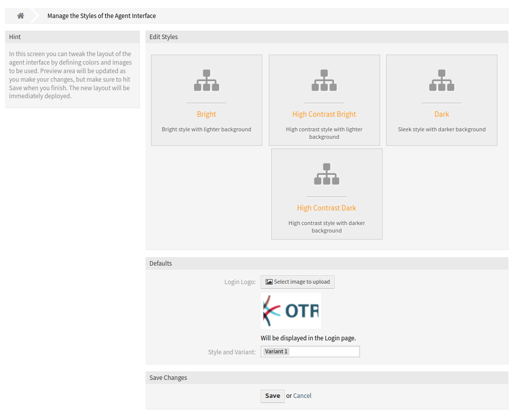
Agent Style Management Screen
The management screen consists of two widget. In the Edit Styles widget can be selected the styles for editing. The Defaults widget defines, which variant will be used as default for the agent interface. The agents can override this setting and they can select a different variant in they personal preferences, but they can not edit the styles.
Manage Styles
Styles are grouped into four categories: Bright, High Contrast Bright, Dark and High Contrast Dark.
To edit a style, select a category first. The edit screen will be opened for the selected category.
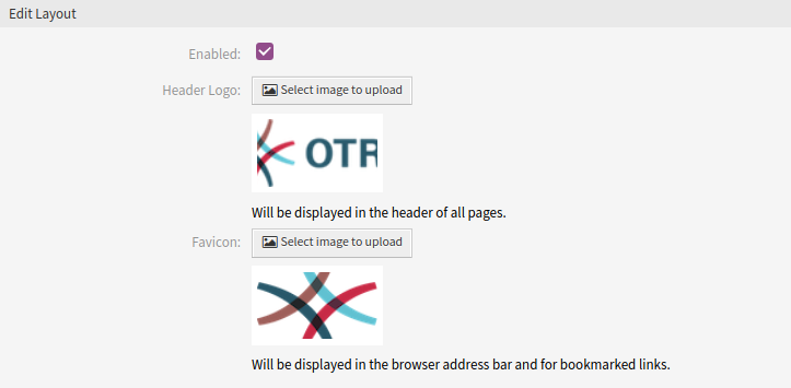
The Edit Layout section is the same for all categories.

Agent Style Layout Edit Screen
The following settings are available when adding or editing this resource.
- Enable
- Select whether the style is available for agents.
- Header Logo
The logo is a small image that is displayed in the header of all pages.
To change the logo, click on the Select image to upload button, and select a new logo image. Recommended file format is PNG.
- Favicon
The favorite icon is an icon that is displayed in the URL bar of the web browser.
To change the favorite icon, click on the Select image to upload button, and select a new icon. This is usually a 16×16 pixel image in PNG or ICO format.
Some categories contain different variants. Each variant can be customize in the same manner.

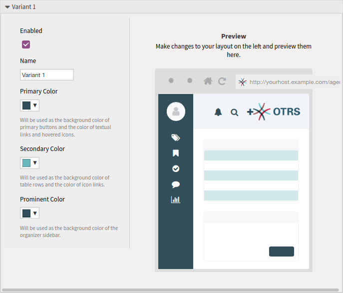
Agent Style Variant
The following settings are available when adding or editing this resource.
- Enable
- Select whether the variant is available for agents.
- Name
- The name of this resource. Any type of characters can be entered to this field including uppercase letters and spaces.
- Primary Color
This color will be used as the background color of primary buttons and the color of textual links and hovered icons.
To change the primary color, just select a new color from the color palette. You can chose from the pre-selected colors or define other colors by choosing it from the color selector or typing the hexadecimal value. The new color will be displayed in the preview widget immediately.
- Secondary Color
This color will be used as the background color of table rows and the color of icon links.
To change the secondary color, just select a new color from the color palette. You can chose from the pre-selected colors or define other colors by choosing it from the color selector or typing the hexadecimal value. The new color will be displayed in the preview widget immediately.
- Prominent Color
This color will be used as the background color of the organizer sidebar.
To change the prominent color, just select a new color from the color palette. You can chose from the pre-selected colors or define other colors by choosing it from the color selector or typing the hexadecimal value. The new color will be displayed in the preview widget immediately.